
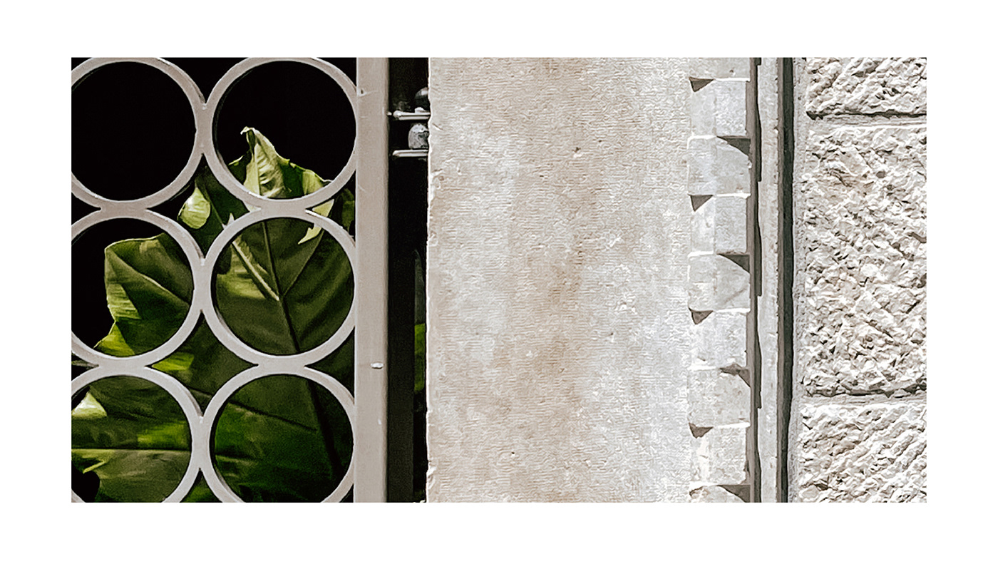
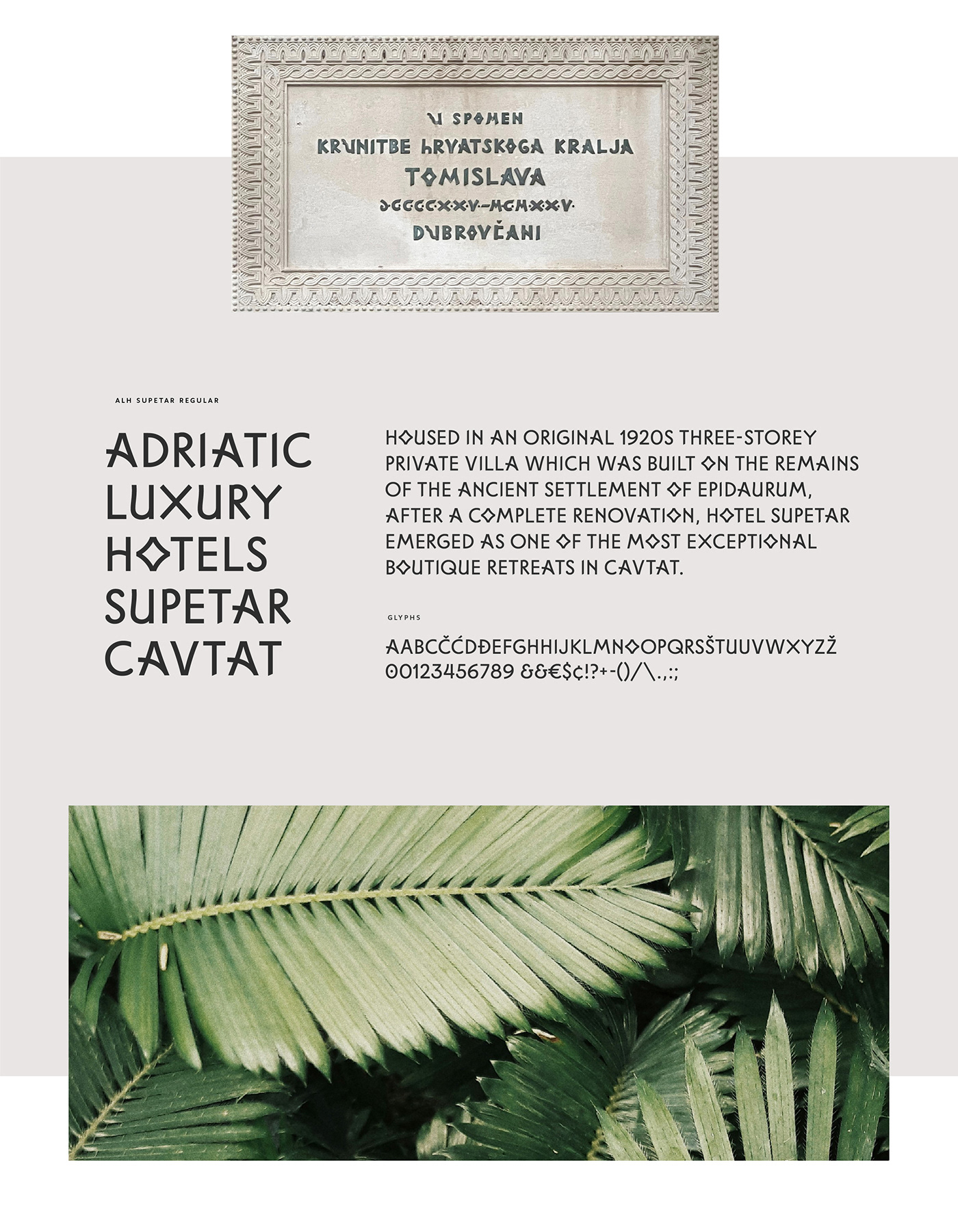
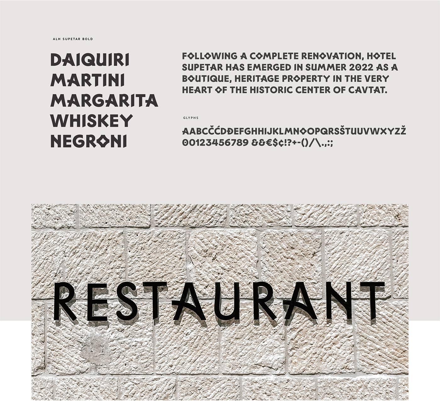
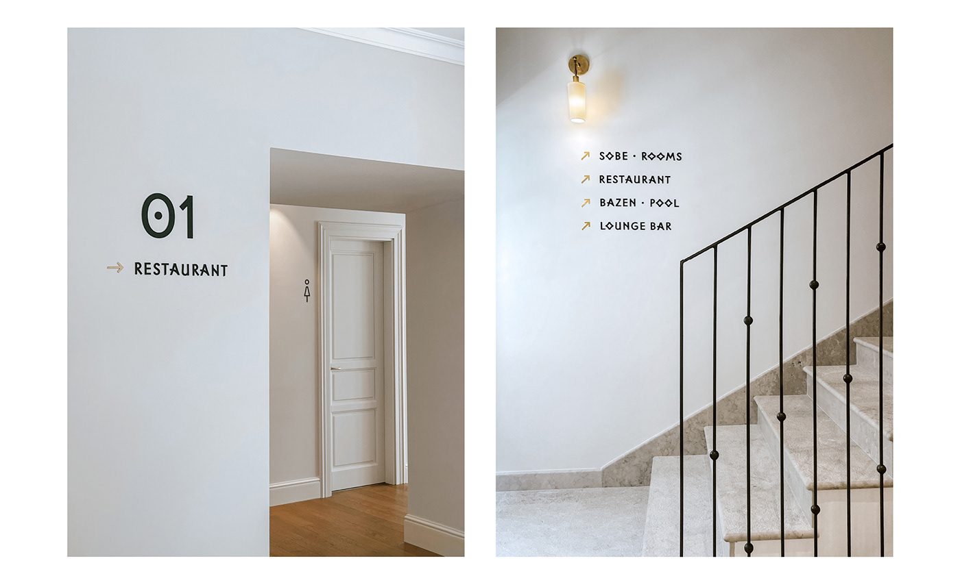
The identity of Hotel Supetar (Cavtat, Croatia) is an eclectic combination of native elements and contemporary execution. An original typeface was designed as the backbone of the identity and is used for wayfinding and other communication means. The typeface is based on letterforms from a stone monument erected by the people of Dubrovnik in 1925 in commemoration of the coronaton of King Tomislav. In contrast to the usual approach to type design, the goal here was to keep as many formal inconsistencies as possible, while still making the letters more readable and usable for a wider range of purposes. Certain characters also have simplified versions, and the typeface comes in two distinct weights.
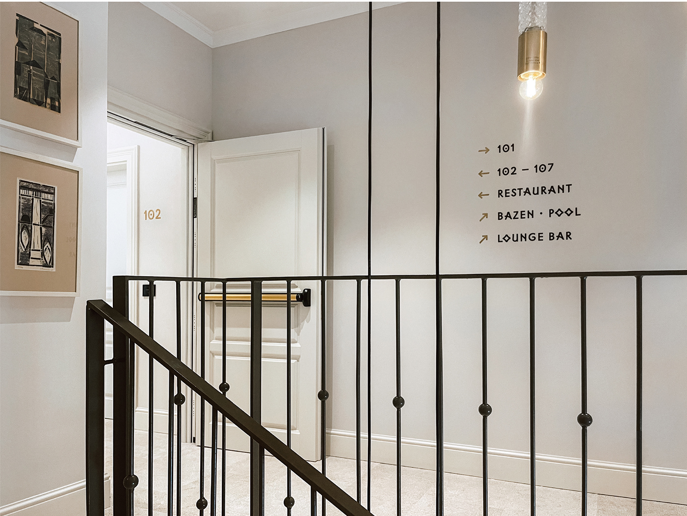
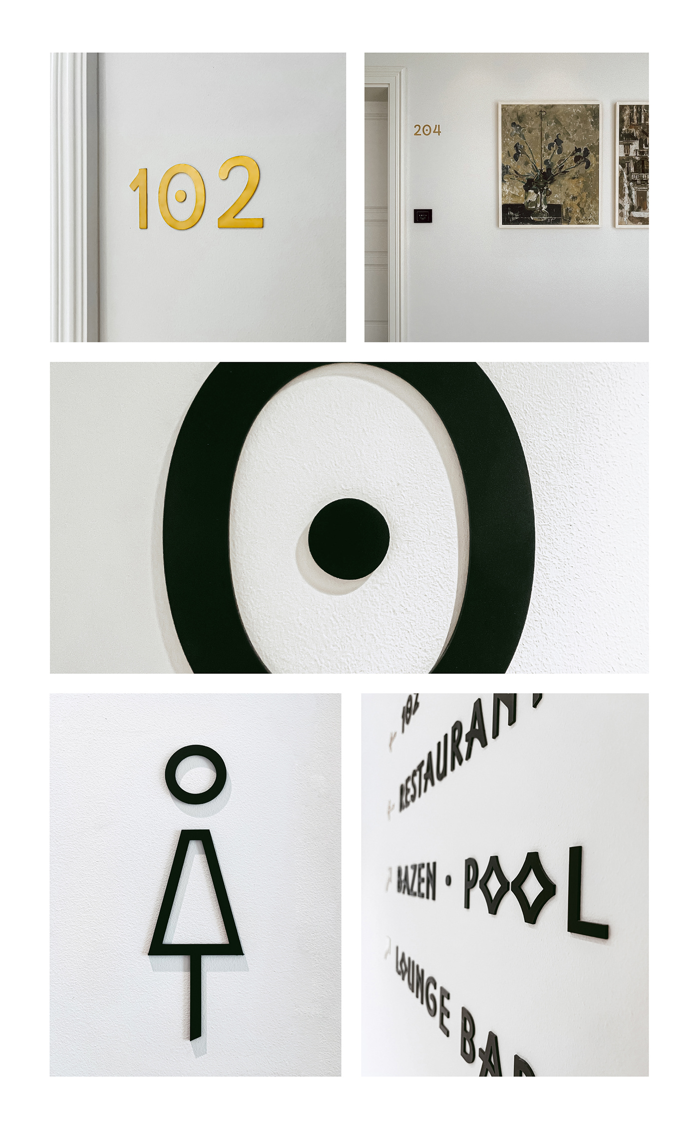
In accordance with the Adriatic Luxury Hotels sustainability policy, the selected materials used for crafting the signage also comply with strict conservation requirements. Black anodized aluminum and brass align with the hotel interior aesthetics while emphasizing typography, whose distinctive characteristics make a visually captivating element.
Designers:
Hrvoje Živčić, type design (website)
Negra Nigoević, wayfinding & graphic design
- - -
Thanks for watching and for more info please visit Adriatic Luxury Hotels official page.
- - -
© Photo credits: Adriatic Luxury Hotels, Negra Nigoević. Please do not use any photo without author's permission. Feel free to contact. :)


